Table of Contents
- Introduction
- 1. Why a Real Estate Logo Matters
- 2. Essential Elements of a Real Estate Logo
- 3. Color Schemes & Typography for Real Estate Logos
- 4. Current Trends in Real Estate Logo Design
- 5. Tips for Creating a Unique Real Estate Logo
- 6. Conclusion
Introduction
In the competitive world of real estate, your logo is much more than just a visual mark—it’s the face of your brand. A well-designed real estate logo helps establish credibility, fosters trust with clients, and sets your business apart from the competition. In this guide, we’ll explore the key elements that make a real estate logo effective, share current design trends, and offer actionable tips for creating a logo that resonates with your target audience. For more branding insights, visit our Teraunits Blog or check out our design services at Teraunits.
1. Why a Real Estate Logo Matters
A strong real estate logo is critical for several reasons:
- First Impressions: Your logo is often the first thing potential clients see, setting the tone for your brand.
- Brand Recognition: A unique and memorable logo makes your business easier to recall in a competitive market.
- Trust and Credibility: A professional logo builds trust, signaling that your company is reliable and established.
- Consistent Branding: A cohesive logo ensures consistent brand messaging across marketing materials, from business cards to billboards.
- Differentiation: In an industry where many companies offer similar services, a distinct logo helps you stand out.
2. Essential Elements of a Real Estate Logo
When designing your real estate logo, focus on incorporating these key elements:
Iconography
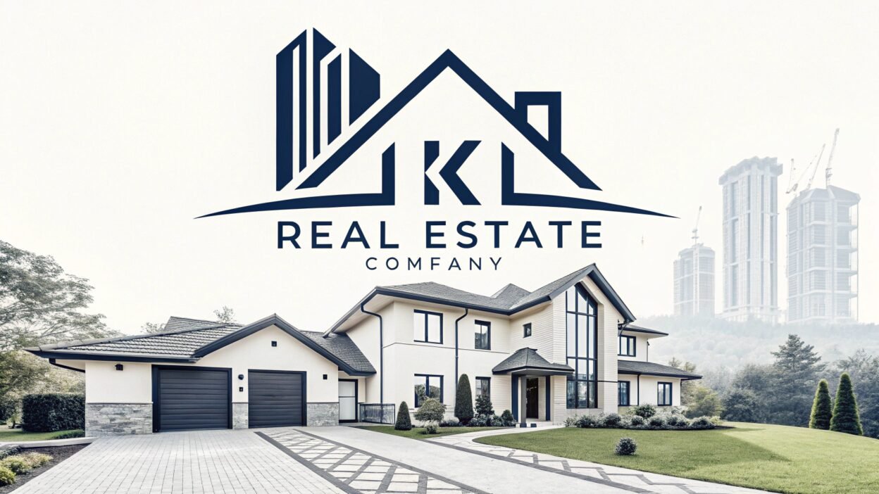
- Relevant Symbols: Use icons that reflect the real estate industry, such as houses, rooftops, keys, or even abstract representations of buildings.
- Simplicity: Opt for clean, straightforward imagery that is easy to recognize and remember.
Typography
- Professional Fonts: Choose fonts that convey professionalism and reliability. Serif fonts can add a traditional feel, while sans-serif fonts offer a modern look.
- Legibility: Ensure the text is clear and legible at various sizes, from digital icons to large signage.
Color Scheme
- Trust and Stability: Colors like blue and green are popular in real estate because they evoke trust, stability, and growth.
- Accent Colors: Consider using accent colors (such as gold or red) to highlight key aspects of your brand, but keep the overall palette balanced.
- Versatility: Your chosen colors should work well in both digital and print formats.
Simplicity & Scalability
- Minimalism: A simple, uncluttered design is often more effective and memorable.
- Scalability: Your logo should look great on everything from small social media icons to large outdoor banners.
3. Color Schemes & Typography for Real Estate Logos
Color Scheme Tips:
- Blue: Conveys professionalism, trust, and reliability.
- Green: Symbolizes growth, prosperity, and a connection to nature.
- Neutral Tones: Black, white, and gray can add sophistication and balance.
- Accent Colors: Use sparingly to add a dynamic touch without overwhelming the design.
Typography Tips:
- Readability is Key: Select fonts that remain legible in various sizes.
- Combine Styles: Consider pairing a bold, modern font for your business name with a more subtle font for taglines.
- Consistency: Ensure the typography aligns with your overall brand identity and messaging.
For inspiration and pre-made templates, check out Canva, which offers a range of customizable real estate logo templates.
4. Current Trends in Real Estate Logo Design
To keep your logo modern and appealing, consider these trends:
- Minimalist Designs: Clean lines and simple layouts are trending for their timeless appeal.
- Negative Space: Clever use of negative space can add depth and creativity to your logo.
- Geometric Patterns: Utilizing geometric shapes can convey stability and structure.
- Responsive Logos: Design logos that are adaptable and look great across all devices and mediums.
- Custom Illustrations: Unique, hand-drawn elements can add a personal touch that sets your logo apart.
5. Tips for Creating a Unique Real Estate Logo
Here are some practical tips to help you craft a standout real estate logo:
- Define Your Brand Identity:
Clearly articulate your brand’s mission, values, and target market. Your logo should reflect these core elements. - Sketch Your Ideas:
Start with brainstorming and rough sketches. Experiment with different symbols, layouts, and fonts to explore various design possibilities. - Leverage Digital Tools:
Utilize online design tools and resources, like Canva, to refine your logo ideas and create high-quality drafts. - Focus on Versatility:
Test your logo in different sizes and formats to ensure it remains effective and recognizable across all platforms. - Gather Feedback:
Share your designs with peers, potential customers, or within design communities to get constructive feedback, then refine your logo based on their insights. - Keep It Timeless:
While staying current is important, aim for a design that will remain relevant and effective for years to come.
6. Conclusion
A powerful real estate logo is a crucial element in building your brand’s identity and gaining a competitive edge in the market. By focusing on essential design elements—iconography, typography, color schemes, and simplicity—you can create a logo that not only stands out but also communicates trust and professionalism.
For more expert design insights and resources, visit our Teraunits Blog. If you need professional assistance or want to explore customized logo designs, check out Teraunits for high-quality design services. And for creative templates, don’t forget to explore Canva.
What elements do you think make a real estate logo truly memorable? Share your thoughts in the comments below!
Keywords: real estate logo, realtor logo, property branding, real estate business logo, professional real estate logos


