Table of Contents
- Introduction
- 1. Why a Photography Logo Matters
- 2. Key Elements of a Photography Logo
- 3. Choosing the Right Typography and Colors
- 4. Current Trends in Photography Logo Design
- 5. Common Mistakes to Avoid
- 6. Conclusion
Introduction
Your photography logo is the face of your brand. Whether you’re a professional photographer or an aspiring creator, your logo should reflect your style, creativity, and professionalism. A strong photography logo not only builds brand recognition but also helps attract potential clients. In this guide, we’ll cover the essential elements, design trends, and tips for creating a logo that stands out.
For more design insights, visit our Teraunits Blog or explore professional logo-making tools at Teraunits.
1. Why a Photography Logo Matters
A photography logo is more than just a design; it’s a crucial part of your branding. Here’s why it matters:
- Brand Recognition: A well-designed logo makes your business more memorable.
- Professional Identity: It sets you apart from amateurs and competitors.
- Marketing Tool: Your logo appears on business cards, social media, and websites, strengthening brand presence.
- Client Trust: A polished, professional logo helps build credibility and trust with potential clients.
2. Key Elements of a Photography Logo
When designing your photography logo, consider these key elements:
1. Iconography
Many photography logos incorporate visual elements that represent the industry. Some popular choices include:
- Camera icons – A classic symbol that instantly connects with photography.
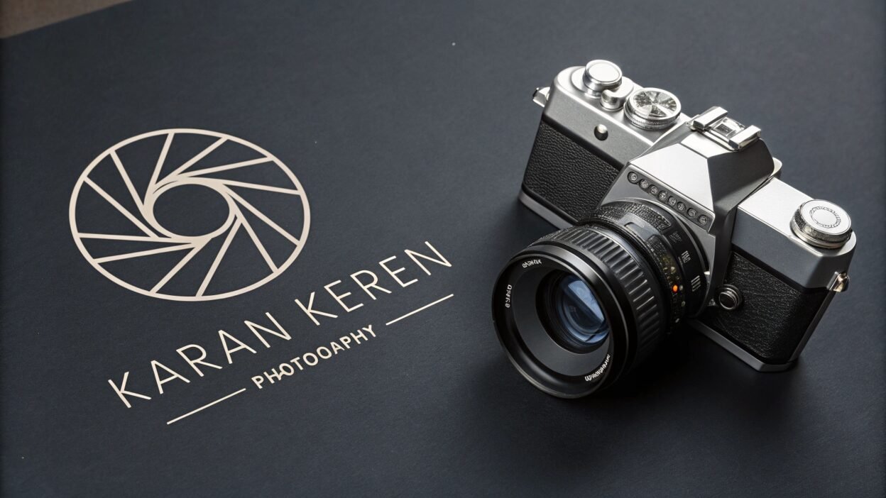
- Shutter or aperture designs – Representing creativity and the art of capturing moments.
- Lens-inspired graphics – A sleek and modern way to symbolize photography.
- Signature-based logos – Great for personal branding, often using elegant script fonts.
2. Typography
The font you choose should complement your photography style:
- Serif fonts – Exude a classic, timeless feel, often used in wedding or portrait photography logos.
- Sans-serif fonts – Modern and minimalist, perfect for contemporary photography brands.
- Handwritten or script fonts – Add a personal, artistic touch to your branding.
3. Simplicity & Scalability
A clean, minimal logo is easier to recognize and works well across various branding materials, from social media profiles to watermarks.
3. Choosing the Right Typography and Colors
Best Colors for Photography Logos
- Black & White – Timeless, elegant, and widely used in photography logos.
- Gold & Silver – Luxurious and perfect for high-end photography brands.
- Muted Pastels – Soft and artistic, great for lifestyle or wedding photography.
- Bold & Vibrant Colors – Ideal for fashion or creative photography businesses.
Typography Tips
- Keep fonts readable, even when scaled down for watermarks.
- Avoid overly decorative fonts that may be hard to read.
- Combine two fonts (one for your name, one for a tagline) for a balanced look.
For ready-made templates and customization options, check out Canva, which offers a variety of photography logo designs.
4. Current Trends in Photography Logo Design
Stay ahead of the competition by incorporating these modern design trends:
- Minimalist Designs: Clean, uncluttered logos with simple icons.
- Monogram Logos: Using initials creatively for a unique, personal touch.
- Abstract & Geometric Shapes: Gives a modern, stylish look.
- Negative Space Logos: Cleverly using empty space to create a hidden image.
- Handwritten Signatures: Adds an elegant, artistic feel.
5. Common Mistakes to Avoid
To ensure your photography logo is effective, avoid these mistakes:
- Overly Complex Designs: Too many elements make the logo difficult to recognize.
- Generic Icons: Using standard clip-art images won’t make your brand stand out.
- Poor Font Choices: Unreadable fonts will make your logo look unprofessional.
- Ignoring Versatility: Ensure the logo works well in black and white, colored versions, and different sizes.
6. Conclusion
A well-designed photography logo is an essential part of branding, helping you stand out in a competitive industry. By focusing on simple yet creative designs, the right typography, and a color scheme that reflects your style, you can create a logo that resonates with your audience.
Looking for more design ideas? Visit our Teraunits Blog or explore professional logo creation services at Teraunits. You can also find inspiration and design templates on Canva.
What’s your favorite photography logo style? Share your thoughts in the comments below!
Keywords: photography logo, photographer branding, camera logo design, photography business logo, professional logo for photographers


