Table of Contents
- Introduction
- 1. What Is a Name Logo?
- 2. Why a Name Logo Matters
- 3. Key Elements of an Effective Name Logo
- 4. Typography & Color Choices
- 5. Current Trends in Name Logo Design
- 6. Tips for Creating Your Own Name Logo
- 7. Resources & Tools
- 8. Conclusion
Introduction
A name logo—also known as a wordmark or signature logo—is a type of logo that focuses primarily on the stylized presentation of a person’s or company’s name. Whether you’re a freelancer, artist, consultant, or small business owner, a distinctive name logo can become the cornerstone of your brand identity. In this guide, we’ll explore what makes name logos effective and share practical tips to help you design one that truly stands out.
1. What Is a Name Logo?
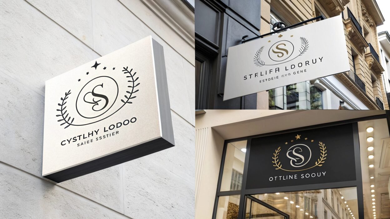
A name logo (wordmark) uses creative typography and sometimes minimal graphic accents to present the brand’s name as its central visual element. Unlike icons or emblems, name logos rely on font, spacing, and styling to convey personality and memorability.
2. Why a Name Logo Matters
- Instant Recognition: Your business or personal name is front and center, making it easy for audiences to remember.
- Clarity: There’s no ambiguity—viewers immediately know your name and brand.
- Versatility: Wordmarks work across digital and print media, from website headers to business cards.
- Professionalism: A polished typographic treatment signals credibility and confidence.
3. Key Elements of an Effective Name Logo
- Typography:
- Choose or customize a font that reflects your brand personality—elegant script for creative professionals, sturdy sans‑serif for tech entrepreneurs, etc.
- Pay attention to kerning (spacing between letters) and letterforms to ensure readability.
- Simplicity:
- Keep embellishments minimal. Let the name itself be the hero.
- Avoid overly complex flourishes that hinder legibility.
- Balance & Proportion:
- Align text elements thoughtfully—consider stacking if your name is long.
- Use subtle line weights and spacing to create visual harmony.
- Graphic Accents (Optional):
- A small icon (like an underline, dot, or simple shape) can add distinctiveness without overpowering the name.
4. Typography & Color Choices
- Font Selection:
- Serif Fonts: Convey tradition, elegance, and reliability.
- Sans‑Serif Fonts: Feel modern, clean, and approachable.
- Scripts & Handwritten Fonts: Add personality and flair, ideal for creative professionals.
- Color Palette:
- Monochrome: Timeless and versatile—black, white, or grayscale.
- Accent Colors: One or two hues that align with your brand values (e.g., blue for trust, green for growth).
- Contrast: Ensure strong contrast for readability across backgrounds.
5. Current Trends in Name Logo Design
- Custom Lettering: Hand‑drawn or uniquely modified typefaces to stand out.
- Minimalist Wordmarks: Ultra‑clean lines and geometric letterforms.
- Ligatures & Letter Connections: Creative linkages between letters for a distinctive flow.
- Responsive Variations: Simplified and full versions for different screen sizes.
- Subtle Gradients: Light tonal shifts to add depth without complexity.
6. Tips for Creating Your Own Name Logo
- Define Your Brand Voice:
Understand whether you want to feel authoritative, friendly, creative, or modern. - Sketch First:
Start with pen‑and‑paper sketches to explore different letterforms and layouts. - Refine Digitally:
Use design software (e.g., Adobe Illustrator) or online platforms to fine‑tune spacing and styling. - Test Legibility:
View your logo at various sizes—from favicon (16×16 px) to print posters. - Gather Feedback:
Share drafts with peers or clients to ensure your logo communicates the intended tone. - Finalize Variations:
Create horizontal, vertical, and simplified/icon‐only versions for maximum versatility.
7. Resources & Tools
- Canva for quick templates and font pairing inspiration → Canva.com
- Google Fonts for a vast library of free, web‑safe typefaces → fonts.google.com
- Font Pair to discover complementary font combinations → fontpair.co
- Teraunits Blog for more design insights and case studies → Teraunits Blog
8. Conclusion
A well‑designed name logo is a powerful branding tool that clearly communicates who you are and what you stand for. By focusing on the right typography, color palette, and simplicity, you can craft a wordmark that not only looks professional but also resonates with your audience.
Ready to bring your name logo to life? Start sketching ideas, refine them digitally, and leverage the resources above to create a wordmark that truly represents your brand.
What style of name logo appeals to you most—minimalist, script‑based, or bold sans‑serif? Share your thoughts in the comments below!
Keywords: name logo, personal logo, typographic logo, custom name branding, signature logo, wordmark design


