Table of Contents
- Introduction
- 1. Why a Construction Logo Matters
- 2. Key Elements of an Effective Construction Logo
- 3. Design Tips and Trends for Construction Logos
- 4. Common Mistakes to Avoid
- 5. Conclusion
Introduction
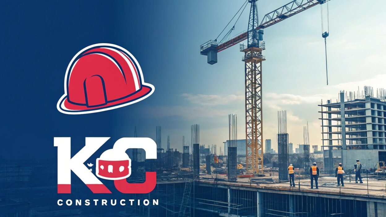
In the competitive construction industry, your company’s logo is more than just a visual mark—it’s the foundation of your brand identity. A well-crafted construction logo communicates reliability, strength, and professionalism, helping you stand out in a crowded marketplace. This blog provides expert insights into the design elements, trends, and best practices for creating a construction logo that truly represents your business.
1. Why a Construction Logo Matters
A strong construction logo is essential for several reasons:
- Brand Recognition: A memorable logo helps clients quickly identify and remember your business.
- Professional Image: It reinforces your company’s commitment to quality, safety, and reliability.
- Differentiation: In an industry where many companies offer similar services, a unique logo sets you apart from the competition.
- Marketing Efficiency: A consistent visual identity across your marketing materials—from vehicles to business cards—builds trust with potential clients.
2. Key Elements of an Effective Construction Logo
When designing a construction logo, focus on these critical elements:
- Iconography:
Use symbols that are directly related to the construction industry, such as cranes, hard hats, tools, or building silhouettes. These elements immediately convey the nature of your business. - Typography:
Choose bold, sturdy fonts that suggest strength and stability. Sans-serif or slab serif fonts are often a good choice for their modern and robust appearance. - Color Scheme:
Consider using colors that evoke reliability and durability. Blues and grays are popular for conveying trust and professionalism, while accents of yellow or orange can add energy and optimism. - Simplicity:
A clean and uncluttered design ensures your logo is versatile and easily recognizable. It should work well on various media, from digital platforms to printed materials like signage and uniforms. - Scalability:
Your logo must look great at any size—from small icons on a mobile website to large banners at a construction site.
3. Design Tips and Trends for Construction Logos
To create a standout construction logo, keep these design tips and trends in mind:
- Minimalism:
Modern construction logos often embrace minimalist design principles. Simplify your design to focus on essential elements that make a bold statement. - Geometric Shapes:
Utilize strong, geometric forms to convey structure and stability. Shapes like squares and triangles can imply balance and support—key concepts in construction. - Dynamic Elements:
Consider incorporating subtle dynamic elements, such as gradients or slight variations in line weight, to add depth and modernity without sacrificing clarity. - Industrial Textures:
Adding a subtle texture or pattern reminiscent of materials like steel or concrete can provide a tactile feel that reinforces the construction theme. - Versatility:
Ensure that your design remains effective in both full color and monochrome formats, as it may need to be used on various backgrounds and materials.
For creative inspiration and design resources, check out Canva, which offers a range of templates and tools tailored to logo design.
4. Common Mistakes to Avoid
When designing your construction logo, avoid these pitfalls:
- Overcomplicating the Design:
Too many elements can clutter your logo, making it hard to recognize at a glance. - Generic Symbols:
Avoid clichéd or overused icons that do not differentiate your brand. Strive for originality in your iconography. - Poor Color Contrast:
Ensure there is sufficient contrast between elements so that your logo is legible in different contexts. - Ignoring Scalability:
A logo that looks good on a computer screen might not translate well to larger formats. Test your design at various sizes. - Inconsistent Branding:
Your logo should reflect your company’s overall brand identity. Avoid trends that may quickly become outdated or misalign with your brand values.
5. Conclusion
A well-designed construction logo is a powerful asset that not only establishes your brand’s identity but also conveys the reliability and strength of your business. By focusing on key design elements such as relevant iconography, bold typography, and a cohesive color scheme, you can create a logo that resonates with your target audience and sets you apart in the competitive construction industry.
Ready to build your brand with a standout logo? For more expert design insights and professional logo design services, visit Teraunits. And for additional creative inspiration, explore Canva.
What are your thoughts on modern construction logo design? Share your insights in the comments below!
Keywords: construction branding, logo design for construction companies, construction company logo, industrial logo design, construction logo


